Footprint Charts for Indian Markets

Footprint Charts for NSE, BSE, and NFO

See exactly how much was bought and sold at every price level — inside every candle. VolumeLens is the first platform to bring institutional-grade footprint charts to Indian equity and F&O. Read absorption, spot exhaustion, catch iceberg orders.

Native NSE tick aggregation. Zerodha + Groww compatible. No data subscription. Last reviewed: 17 Aug 2026.

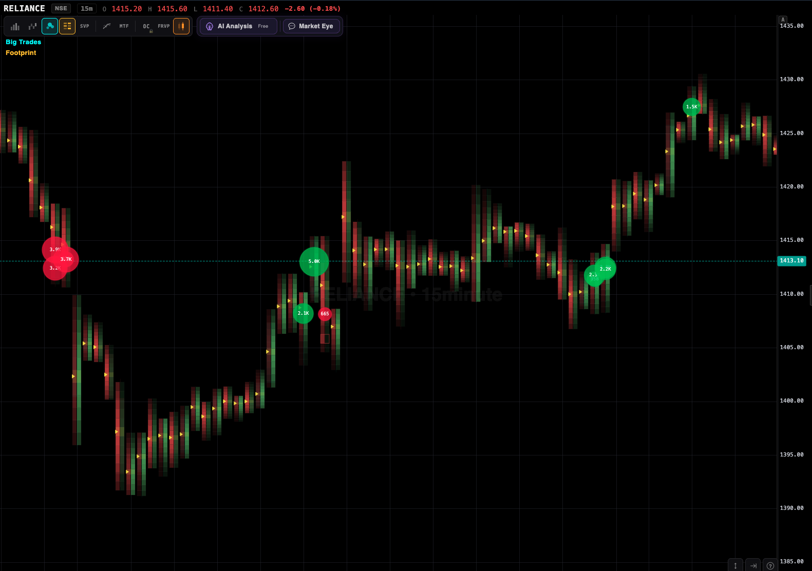
Footprint chart showing bid and ask volume at every price level

What is a footprint chart?

A standard candlestick chart compresses an entire time period — say, 5 minutes of trading — into four numbers: open, high, low, close. Plus a volume bar. That's it. Every trade, every print, every buyer and seller gets flattened into those four OHLC values.

A footprint chart doesn't throw any of that detail away. Instead of a single candle body, you see a grid. Each row of the grid is a price level. Each cell shows how much volume traded at that price, split into how much hit the ask (aggressive buying) vs how much hit the bid (aggressive selling).

Now instead of "the stock went up ₹10 on 3 lakh volume", you see: "₹2,455 had 80k buy, 20k sell. ₹2,460 had 45k buy, 5k sell. ₹2,465 had 8k buy, 2k sell." You immediately know the move was driven by aggressive buyers lifting offers — not just drift on low activity.
The specific patterns footprint reveals

Absorption

A large resting buyer sits at a price level and eats every offer that comes in. On the footprint, you see massive buy volume at that price but price doesn't move higher — it consolidates. This is usually a smart-money accumulation signal. When the absorption is complete, price typically breaks out hard.

Exhaustion

A strong trend candle with final-push characteristics: very high volume, but the delta (buys minus sells) is surprisingly weak or even negative. Buyers are tired. The candle looks strong; the footprint says demand is drying up. When the candle and the tape disagree, the disagreement itself is the information.

Iceberg orders

The same price level keeps getting volume without the price moving through it. Someone is reloading their order every time it gets filled. Icebergs reveal institutional positioning — join that side, don't fight it.

Stop-run-and-reverse

Price spikes through a key support or resistance level (running stops), but the footprint of the spike candle shows weak delta. Then the next candle has strong opposing delta. This is the classic liquidity grab — the operator runs stops, takes the other side, and reverses price. Happens daily on Nifty futures near round numbers.

Value area rejection

Price probes outside the session's value area but the delta fades at the extreme. Smart money rejects the outlier and pushes price back to the mean. Another high-probability mean-reversion setup that footprint makes obvious.

The four types of footprint charts

"Footprint chart" is a family, not a single view. The same per-price data can be displayed four ways, and most platforms (VolumeLens included) let you switch between them:

TypeWhat each cell showsBest for
Bid/Ask footprintVolume at bid × volume at ask, per priceSpotting who was aggressive — the default view
Delta footprintThe net difference (ask volume − bid volume) per priceReading imbalance at a glance without mental arithmetic
Volume footprintTotal traded volume per priceFinding the high-volume node inside a single candle
Imbalance footprintOnly the levels where one side traded ≥3× the diagonal oppositeFiltering noise — showing only one-sided aggression

Settings that actually matter

Three settings change what a footprint tells you more than anything else: price grouping (how many ticks per row — too fine and every cell is noise, too coarse and structure disappears; liquid NSE stocks usually read well at 1–2 ticks, higher-priced stocks need wider rows), the imbalance ratio (3:1 diagonal is the convention; raising it to 4:1 shows only the most lopsided levels), and the timeframe (footprints reward 1–15 minute bars — above that, aggregation buries the fine structure the chart exists to reveal).

Before footprint vs after footprint

What you seeWithout footprintWith VolumeLens footprint
Big green candle at resistanceLooks strong to a candle-only readerDelta is -30% — the rally was net-sold into. Candle and tape disagree.
Long wick rejection at supportSellers defeatedFootprint shows 5x absorption at the low — large passive buyers ate the selling.
Breakout through swing highMomentum confirmed?Delta only +10% — the break printed with little aggressive participation.
Pin bar at daily pivotClassic reversal?Footprint confirms — opposing delta was 4x. Strong trade.
Consolidation for 30 minWaiting gameFootprint shows absorption on one side. Side is now knowable.

How VolumeLens renders footprint for NSE

This is the technical challenge that kept footprint unavailable to Indian retail for years. Real footprint requires real tick data — every single trade, timestamped, with the side (buy or sell at ask or bid). Most Indian charting platforms aggregate from 1-minute OHLC bars and fake the footprint, which is useless.

VolumeLens ingests the actual NSE tick stream via your broker's API (Zerodha Kite Connect or Groww API), aggregates it server-side into footprint clusters, and renders within 500ms of the tick hitting the exchange. The cluster size (tick size, 0.05 paise increments) adjusts automatically based on the instrument.

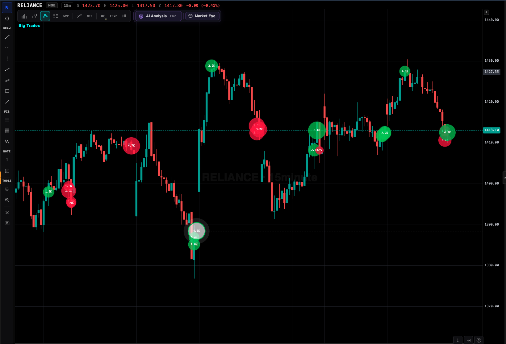
Large trade prints highlighted on footprint

Footprint display modes

Bid × Ask split

Each cell shows buy volume (at ask) on the right, sell volume (at bid) on the left. Classic footprint view. Best for general use.

Delta mode

Each cell shows the net delta (buy minus sell). Color-coded by sign. Easier for fast scanning.

Profile mode

Volume-at-price bars within each candle. Shows where most trading occurred. Merges profile with footprint.

Imbalance highlight

Auto-marks cells where buy:sell ratio is 3:1 or higher. Stacked imbalances (3+ in a row) are flagged as high-probability signals.

What you can do from the footprint chart

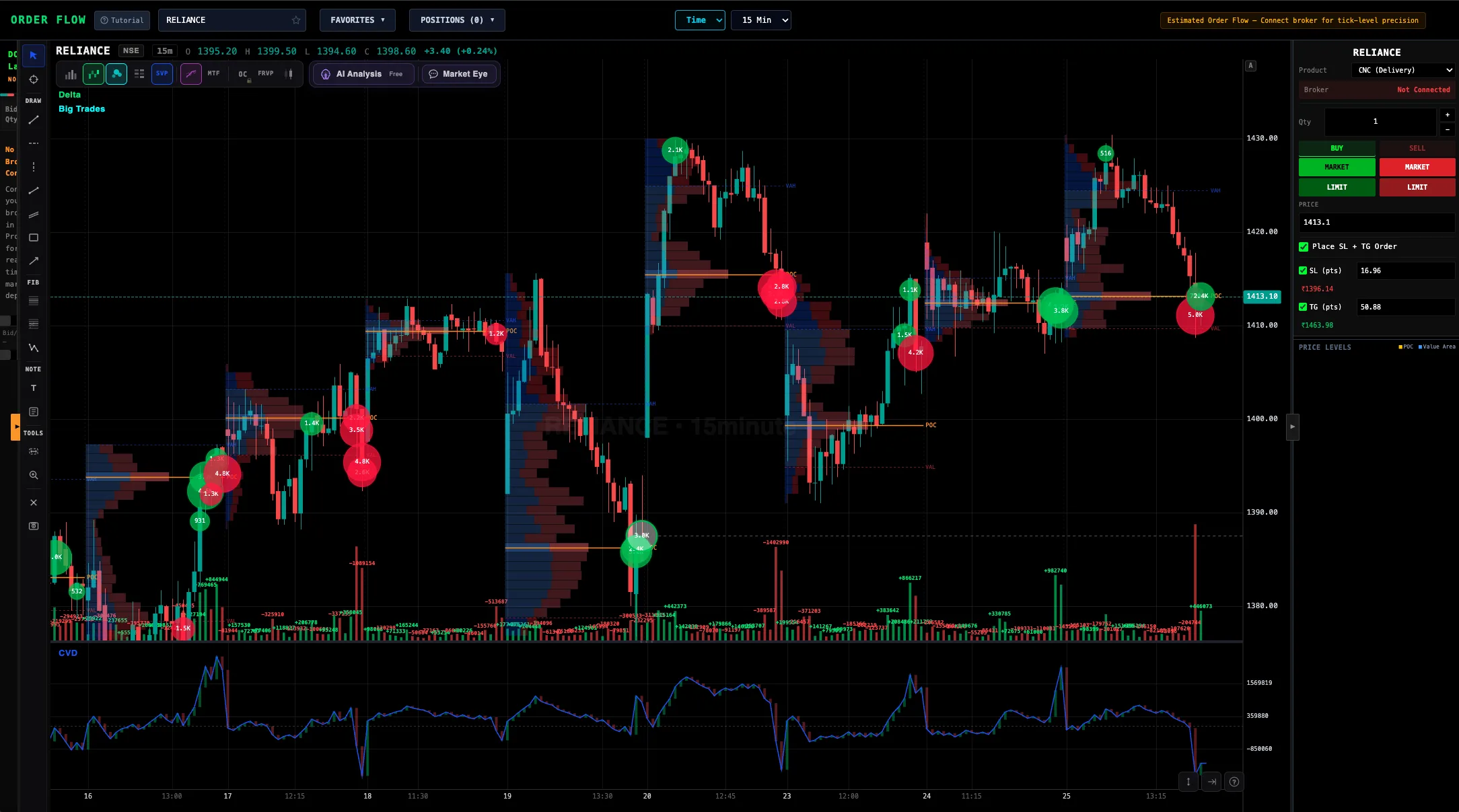
Multi-chart order flow layout

Who uses footprint charts

Globally, footprint is the standard for professional intraday and swing traders at prop firms, CTAs, and hedge funds. In India, it is just becoming available to retail. Early adopters include:

Frequently asked questions

What is a footprint chart?

A chart type showing exact buy and sell volume at every price level within each candle. It reveals aggression, absorption, and exhaustion that candles hide.

Are footprint charts available for Indian stocks?

Yes. VolumeLens is the first retail platform offering native footprint for NSE equity, BSE equity, and NFO futures and options.

How do I read a footprint?

Each cell is volume at a price. Green = aggressive buying (filled at ask), red = aggressive selling (filled at bid). Imbalances (3:1) are highlighted automatically. Stacked imbalances often signal breakouts.

What makes VolumeLens footprint different?

Native NSE tick aggregation, broker-feed based (no extra data fees), sub-500ms latency, integrated with DOM ladder + CVD + volume profile, one-click execution from the chart.

Do I need a separate data subscription?

No. VolumeLens uses your Zerodha or Groww tick feed. Zero extra data cost.

Which timeframes support footprint?

1-min, 3-min, 5-min, 15-min, hourly. Plus tick-based (every N ticks = one cluster) and range-based (every R rupees = one cluster).

What are the types of footprint charts?

Four main types: bid/ask (volume at bid vs ask per price — the default), delta (net difference per price), volume (total per price), and imbalance (only the levels with 3×+ one-sided aggression). All four are views of the same underlying per-price data.

Does it work on mid-cap stocks?

Footprint requires reasonable liquidity. On stocks with less than ₹10 crore daily turnover, clusters become sparse and less useful. Ideal on Nifty 500 equity and liquid F&O.

Can I learn footprint from scratch here?

Yes. The AI Mentor can explain the patterns on your chart in plain English — "this is absorption — heavy aggressive selling met by large passive buyers" — which is the fastest way to learn pattern recognition.

Daily order-flow data, stock by stock

VolumeLens publishes free daily data pages for 450 NSE stocks — closing price, delivery percentage, 52-week position and the session's order-flow numbers (net delta, large-trade split, highest-volume price). A few examples:

Browse all 450 NSE stock data pages → · Daily screeners (52-week highs, delivery spikes, order-flow leaders) → · Compare footprint & order flow platforms in India → · Volume profile for NSE →

See inside the candle

Footprint, DOM, volume profile, CVD — the full institutional-grade order flow stack, native to Indian markets.